Web design has never been so advanced, interactive, and artistic. Building a new website in 2019 is an exciting time, with so many progressive tools at the disposal of designers and programmers.
The one goal for websites is to standout. In order to deliver information to users, their attention needs to be gained. Research suggests that positive or negative judgment can be passed on a website in as little as 50 milliseconds. So your design and user experience better be damn good.
Connecting with the 2019 consumer can be difficult, however, with some good planning and better design, you can position your website to win over the most critical web surfers.
1. Vibrant Colors Are Everywhere
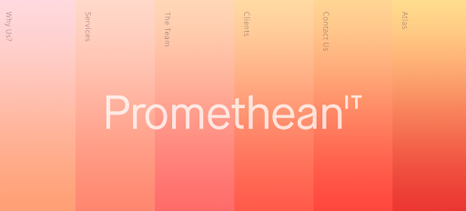
This year is definitely marked by the color pallet that is starting to cover all the hip dot coms. Jump around on the internet and you’ll notice lots of bright pastels. This shift to vibrant color schemes is being adopted from new start-ups to large multi-million dollar companies.

What better way to make a statement with a website visitor than shocking them with some periwinkle.
2. Videos Are Basically Mandatory
The incorporation of video into website design isn’t unique to 2019. The progression of video for all marketing mediums has quickly risen over the past five years. That being said, instead of a static image on your homepage, a background video with text overlay has become a popular choice.
However, don’t be fooled — video is becoming more engaging. From POV to 3D capabilities, web page video has cranked the amp to 11 this year.
3. Transitions Are Making Scrolling Cool Again
Nothing is more boring than vertically scrolling up and down a page. What an underwhelming user experience. Thankfully, 2019 is changing up this narrative. With page transitions that add interactive elements, content progression is becoming less one dimensional.
From directional flying text to graphics animations, transitions are enabling content to be supplemented with this forward-thinking design method.
4. Micro-Interactions Are Hidden Gems
Sometimes less is more, and that’s the best rule with micro-interactions. We are seeing more and more clickable elements adding in micro-interactions that draw in greater interest surrounding that particular item.
From CTA buttons to meaningful information that needs special attention, designers are adding in fun animations that highlight certain content. However, overusing micro-interactions can ruin an otherwise cool user experience.
5. Glitch Art Can Be A Homerun
Nothing more aggravating than a glitching screen, right? Think again. This year has seen glitch art rise through the ranks of design, as tons of home pages are now implementing this retro-style trend.
With doubled exposed text, looping glitch styled video, to warped animations — glitch art definitely catches the attention of most website visitors.
6. Great Design Is Sometimes Simple
There is that famous quote by Antonie de Saint-Exupéry, “A designer knows he has achieved perfection not when there is nothing left to add, but when there is nothing left to take away.” This statement is definitely in the drinking water for designers, as minimalism has been a common trend seen throughout the year.

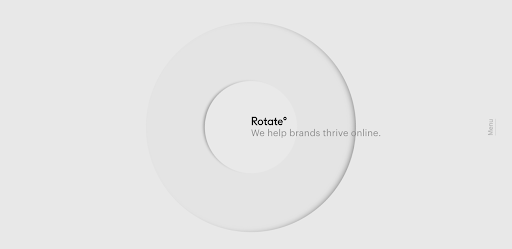
Curated images, targeted text, straightforward layout. As much as out of the box design has taken place this year, the other side of the spectrum has been well represented.
7. Serif Typeface Has Become Popular
Sans serif has long dominated in the online typeface game, however, in 2019 that standard is being rewritten. The decorative typeface is adding an extra touch to web design that viewers seem to support.

8. Two Halves Make A Whole
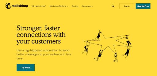
Split-screen design is filling up web pages. The cross-cut design trend is great for mobile users, and that needs to be the focal point for web designers. Splitting pages in half, whether with images, illustrations, video, text, or so on, creates a dynamic viewing experience.
Needing to create an enjoyable and unique viewing experience, split-screen design delivers just that.
9. Odd Shapes?
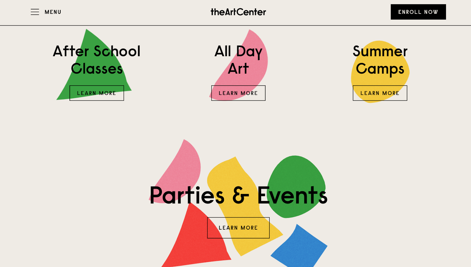
Yes. Both organic and geometric shapes are a go-to trend in 2019. These odd shapes are allowing designers to create eye-catching interest throughout a website. Add in a little white space, and a few big yellow hexagons have never been so aesthetically pleasing.

10. Thumbs Must Love A Website Design
As hinted at, mobile is quickly becoming the biggest driver of internet traffic in 2019. As the majority of searches are being powered from a smartphone, websites can’t just cater to mobile, they need to be built for mobile.
This translates to how thumbs navigate on a cell phone. Designers are noticeably integrating elements that make the web experience easier for the thumb… what a weird sentence.
Need A New Website?
At Venta Marketing, we are helping businesses meet their goals head-on. As leaders in the digital marketing industry, we know what great web design looks and feels like. Contact us today to inquire about our web services!
