You already know that video is an incredibly engaging medium and increases the likelihood of user conversions. You use it in your ads and emails. You use it on your website and social media accounts, and you probably use it on your landing pages. But exactly how valuable are videos on landing pages? According to TechCo, video on landing pages can increase conversions by over 80%! And that’s not all they do. Videos help attract audience members with short attention spans, decrease bounce rates, increase user time on page, and all of this will ultimately help your SEO ranking.
To help you create the best landing page possible here is our guide to using video and multimedia assets for lead generation.
#1 Keep It Above The Fold
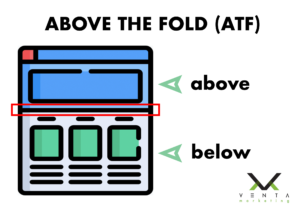
Your most engaging content should ALWAYS be placed above the fold of your landing page. This means that your video should be located in the first place your user’s eye lands on when they see the landing page. Allow your video to speak for itself and only use simple messaging or calls to action above the fold to increase conversions. You don’t want to overwhelm your audience with too much copy so give your video room to engage your page visitors. The most common place for a landing page video is in the “hero”, the largest portion at the top of the page, but that doesn’t mean this is the only option. Play around with your landing page real estate and AB Test the video’s placement with left and right justifications. Testing video placement and tracking user behavior will allow to see exactly how your audience converts and engages with your content.

#2 AB Test Your Video Content
To further your understanding of your user’s behavior, try testing your video content and messaging. This experience will deepen your understanding of what you think your message tells the user versus what the customer actually responds to. To create the best video environment for testing, avoid using fluffy content in your video that confuses the user. Make your message and calls to action specific, explain your process or services with simple animations to keep them engaged, and use language that everyone can understand. Once you have created the core content of your video that’s when you can begin to experiment with your flexible messaging.
#3 Avoid Bad Thumbnails
No, I’m not talking about your manicure. I’m talking about your video’s thumbnail image, aka the static image that previews your video before it starts playing. Think of the thumbnail as the window to your video, it gives your audience their first impression of your unique multimedia asset. If the image you selected is unflattering towards the main subject, disruptive to the rest of the landing page, or it just looks bad, reconsider using that thumbnail and find an alternative. You can also perform AB Testing on your thumbnails to see what results in more video clicks. Thumbnails are just as important as the rest of your video so make sure that you select the best thumbnail to attract viewers.

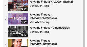
Here are some great examples of thumbnails on YouTube.
Create stunning thumbnails with Adobe Spark
#4 The Power Of One vs. The Power Of Two
Using more than one multimedia asset on your landing page is rather unconventional but marketers are seeing positive results with this technique. For years people thought that one video should stand alone on a landing page but people are now beginning to explore other possibilities. Adding an additional video to your landing page, somewhere below the fold or towards the bottom, will continue to engage page visitors and the video will help you avoid adding too much content.
The size of your second video is also very important because you do not want to it compete for your user’s attention with your first video. Make your second video smaller and place it under the fold or at the bottom near the secondary lead form. The content of your second video should also differentiate itself from the first. Your video above the fold should include the most important information about your business, service, or offerings while your second video should contain the information or emotions that help validate the desired actions of your customers. If adding a second video asset to your landing page sounds overwhelming, stick with one and allow that video to shine.
#5 Keep It Short & Sweet
Landing page visitors want one thing. Answers to their questions. To answer their questions in the most engaging way possible use video to convey your solutions. But don’t ramble on about the benefits of your service or products because your video should always be 90 seconds or less. 90 seconds?! Yes, that sounds brief in theory but in video that is actually a substantial amount of time to inform your user without boring them. Longer videos that lack clarity will obliterate your chances of conversion so keep things brief, informative, and direct. After all, if you need to share more information with your customer try adding that secondary video below the fold!
