Landing pages need to stop being an afterthought, or quick one-off projects. Just because these stand-alone pages are able to be produced with little turnaround time, doesn’t mean they shouldn’t receive an ample amount of strategic investment.
Let’s be frank for a minute.
Landing pages are swept under the rug. They are the middle child in the digital marketing family. But in reality, landing pages play a much bigger role in the success of any campaign. They can be uniquely tailored to fit any stage in the sales funnel. Few other elements are so versatile.
Yet, they still lack the respect they deserve. Many businesses fail to create enough landing pages, and heaven forbid they do a little A/B testing with their variants. Landing pages are not a set it and forget it strategy. Businesses need to be constantly creating, tweaking, and revising their landing pages — companies get over 55 percent more leads when they increase their number of landing pages from 10 to 15.

But what is the goal with landing pages? Yeah, that’s right, collect information. That form submission needs to be the right concoction of elements in order to motivate page visitors to fill it out. Across all industries, the average page conversion rate is 2.35 percent. Doesn’t seem that great…
Did you know that only 3 percent of users will fill out four fields on a contact form? So what does this tell us? Well not that much, because we lack context. Landing page forms convert or don’t convert for a multitude of reasons, which largely depend on the page content, design, and user experience. However, sales funnel position, information type, and industry category also become factors by the end of it.
“As marketers. we focus on what we want from our target audience. What is our ask, what action should they take, what do they think of our brand. But when asking for personal information we need to reframe that thinking into, what will THEY get from US? The form design, placement, button color, all of that makes a noticeable impact on conversation rates. But when it comes down to it, the consumer needs to know – what are we giving them in return? Make in clear, and make it valuable.”
Elizabeth Moosburner, Venta Marketing Lead Designer
Before we jump into some great form types to test out on your landing pages, let’s just rehash some best practices with landing pages.
Landing pages shouldn’t:
- Be too long (can turn off page visitors)
- Be too short (lacks enough information for visitors)
- Ask for too much personal information
- Waste time and attention on meaningless form submission steps
Landing pages should:
- Be optimized for mobile use
- Invest time in headline and CTA copy
- Create sizable incentive
- Use directional cues
- Stick to one singular offer, promotion, or request
- Use single-column layouts
- Incorporate video when applicable
The Emotional One
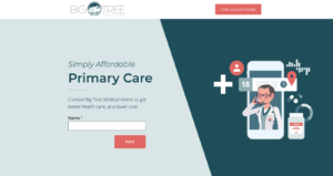
Emotion is a powerful force. Forms that leverage human feelings are able to motivate individuals to provide their information.


The Life Improvement One
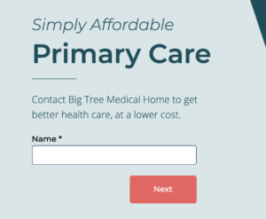
Most of us only buy a product or service if we see a direct benefit to our lives. If that benefit is clear and persuading enough, people will submit a form request.


The Direct One
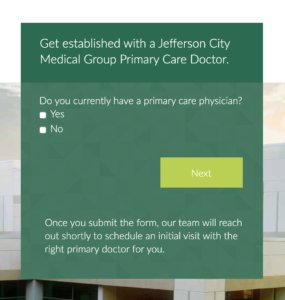
People don’t like to waste time. Cut to the chase, and get to the point. When a landing page form is honest and direct, people are more inclined to continue if they have a sense of understanding of what to expect.


Need Help with Landing Page Forms?
At Venta Marketing, we are helping businesses meet their goals head-on. As leaders in the digital marketing industry, we know the ins-and-outs of what makes a good landing page. Contact us if you are curious about how we can help you grow!
